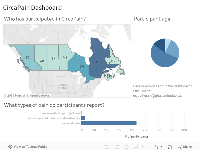
Welcome to the CircaPain Dashboard! We will be displaying some of our results here as we collect them.
To use the dashboard, hover over or click on the different elements (e.g., wedges in the pie chart, bars on the bar graph, or provinces on the map) to see some statistics about the data we have collected so far.